The administration listened to us and decided to reinstate our original athletics logo. I am incredibly proud of how our campus came together to restore the mark that carries so much history for all of us.
April 6, 2016

Final supporters
#BringBackOurLogo
Sponsored By: Will Weber & Ellen Wilshire for 2016 NKU SGA President & Vice President
NKU Athletics has changed our primary athletics logo!
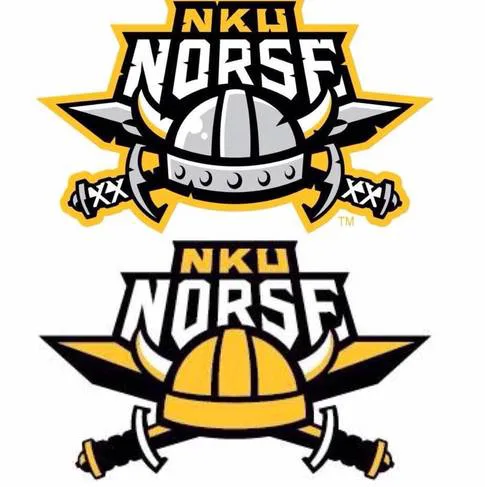
In the picture above, the top image is of our old athletics logo. It is being replaced with the bottom image as our new athletics logo. It is time for the administration to hear what the students want!
If you want to help #BringBackOurLogo then sign the petition!
More Info:
1. Northerner Old Logo Article (9/14/05):
http://www.thenortherner.com/news/2005/09/14/new-a...
2. NKU Athletics Press Release New Logo (3/16/16):
http://nkunorse.com/news/2016/3/16/general-nku-ath...
3. NKU Athletics Brand Identity Guidlines (3/16/16):
http://nkunorse.com/documents/2016/3/16/NKU_Athlet...
Updates
Reached 250 supporters
March 21, 2016
Reached 100 supporters
March 21, 2016
March 21, 2016
We are approaching two hundred and fifty signatures and the momentum is finally shifting in our favor. Please send this link to your campus group chats right now so we can hit this goal and force the administration to look at our demands.
March 20, 2016
We are grinding toward one hundred signatures and I need your help to push us over that threshold. Please link this page to your social media accounts so the administration understands that we refuse to let our school identity be stripped away without a fight.
83 Comments
I understand the fiscal advantages of changing our logo to two colors, however we as the student body are the ones that purchase the NKU merchandise, and attend athletic events. I believe that the logo should match what we like and our voices should be given consideration as this decision directly effects us.
I love the old logo better. Its not that the new one is like horrifyingly ugly... it just takes away the charisma and the Norse pride that the old one has!
We have lost all dimension with the new logo. While I can understand simplifying it, it is now over simplified. Taking the notches out of the letters and the swords would have helped with the simplification process instead of taking ALL detail away.
The new logo is not appealing to the eyes and the student body wasn't even consulted about the change before it happened.
As a design, the logo is flat, and lacking dimensions. The only thing that has any depth are the horns which look like they're attached to an old leather football helmet without the sides. It seems NKU went for a three color logo to cut down on marketing costs.
This is a waste!! Of time, money (for redesign), and resources.
Yea!
Share this petition
Share this petition to help it reach more people.
Your share link
The administration listened to us and decided to reinstate our original athletics logo. I am incredibly proud of how our campus came together to restore the mark that carries so much history for all of us.
April 6, 2016
Final supporters
#BringBackOurLogo
Sponsored By: Will Weber & Ellen Wilshire for 2016 NKU SGA President & Vice President
NKU Athletics has changed our primary athletics logo!
In the picture above, the top image is of our old athletics logo. It is being replaced with the bottom image as our new athletics logo. It is time for the administration to hear what the students want!
If you want to help #BringBackOurLogo then sign the petition!
More Info:
1. Northerner Old Logo Article (9/14/05):
http://www.thenortherner.com/news/2005/09/14/new-a...
2. NKU Athletics Press Release New Logo (3/16/16):
http://nkunorse.com/news/2016/3/16/general-nku-ath...
3. NKU Athletics Brand Identity Guidlines (3/16/16):
http://nkunorse.com/documents/2016/3/16/NKU_Athlet...
Updates
Reached 250 supporters
March 21, 2016
Reached 100 supporters
March 21, 2016
March 21, 2016
We are approaching two hundred and fifty signatures and the momentum is finally shifting in our favor. Please send this link to your campus group chats right now so we can hit this goal and force the administration to look at our demands.
March 20, 2016
We are grinding toward one hundred signatures and I need your help to push us over that threshold. Please link this page to your social media accounts so the administration understands that we refuse to let our school identity be stripped away without a fight.
83 Comments
The old logo was fierce. The new logo looks like a construction workers hard hat. Without the gray, the horns almost disappear completely. It's flat and boring.
I understand the fiscal advantages of changing our logo to two colors, however we as the student body are the ones that purchase the NKU merchandise, and attend athletic events. I believe that the logo should match what we like and our voices should be given consideration as this decision directly effects us.
I love the old logo better. Its not that the new one is like horrifyingly ugly... it just takes away the charisma and the Norse pride that the old one has!
We have lost all dimension with the new logo. While I can understand simplifying it, it is now over simplified. Taking the notches out of the letters and the swords would have helped with the simplification process instead of taking ALL detail away.
The new logo is not appealing to the eyes and the student body wasn't even consulted about the change before it happened.
As a design, the logo is flat, and lacking dimensions. The only thing that has any depth are the horns which look like they're attached to an old leather football helmet without the sides. It seems NKU went for a three color logo to cut down on marketing costs.
This is a waste!! Of time, money (for redesign), and resources.
Yea!
Share this petition
Share this petition to help it reach more people.
Your share link
Petitions like this
Other petitions you might want to support




Scan to share
Anyone who scans this can sign the petition.
The old logo was fierce. The new logo looks like a construction workers hard hat. Without the gray, the horns almost disappear completely. It's flat and boring.