Status: Closed — this petition is no longer accepting signatures.


Final supporters
This petition is to urge google to restore their original font to their search page.
I do not like the new logo.
More like this
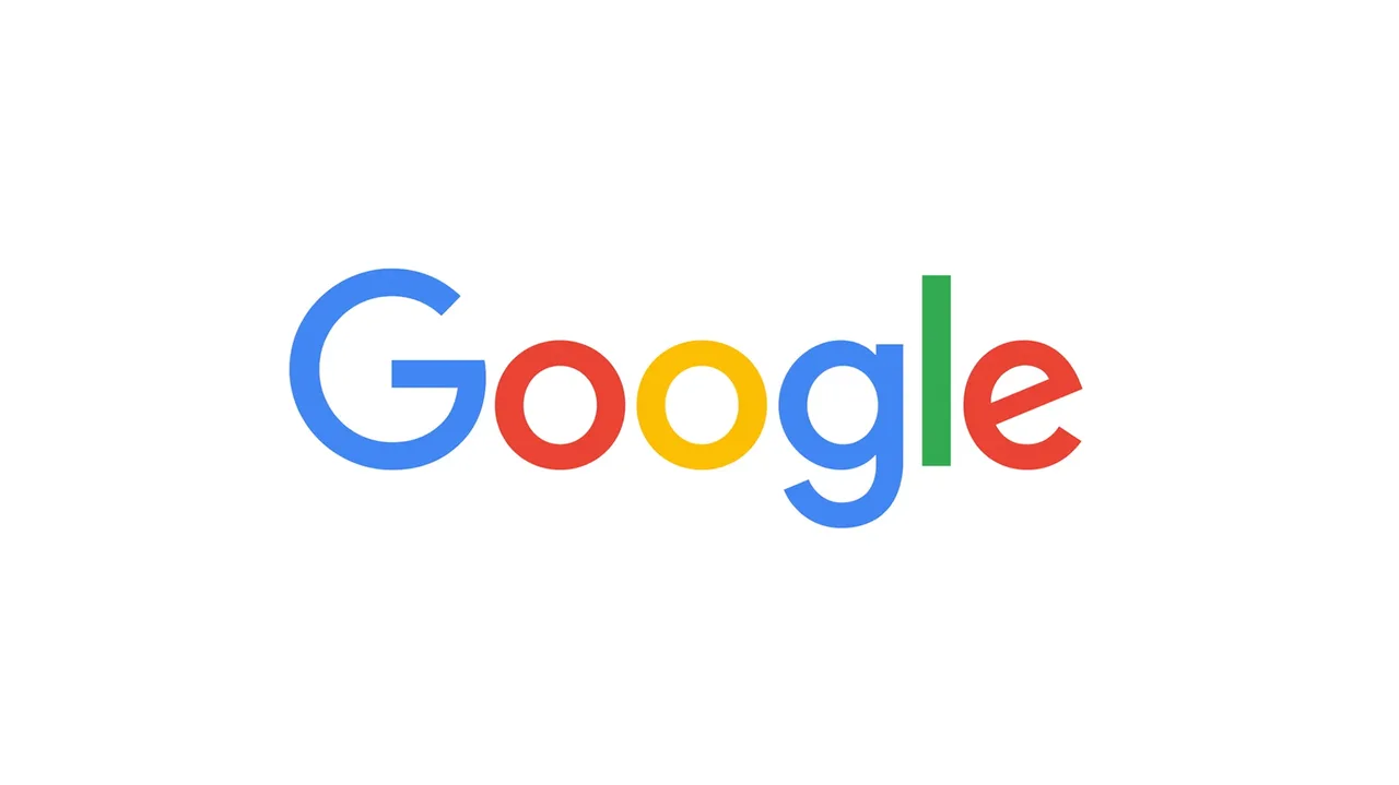
Dear Google get rid of the "New Look"
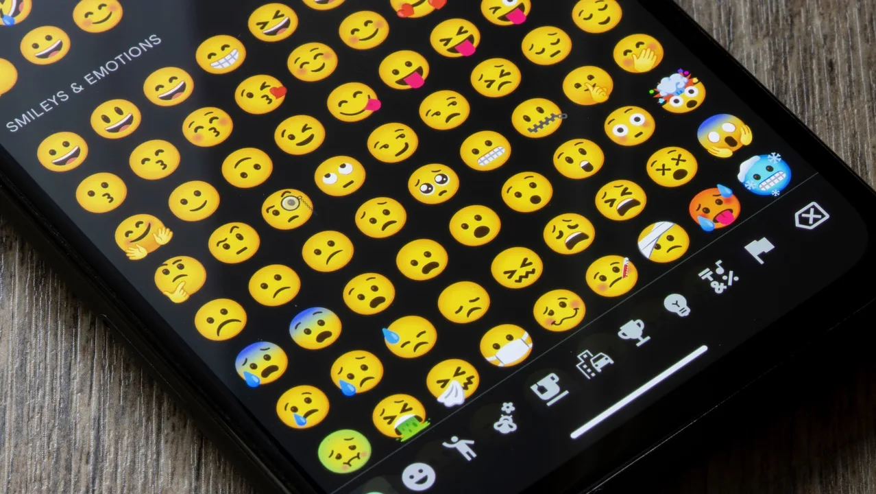
Give Us Back Our Emojis
32 Comments
Please restore the old logo. The new one looks TOO plain/childish. It puts me off using it. The old logo font encouraged me to actually use google for research but now it doesn't look official anymore. Also, when the new symbol was released, almost everyone I know instantly was trying to get rid of it because it looks like a virus, since usually viruses try to use 'fun' colours and look alot like the new google symbol. Google now just looks fake and unofficial.
I understand some of the reasoning behind the change, but feel this makes google appeal more to children rather than adults. I would like to the logo to return to its previous state so I can log into chrome and see the google with a iota of professionalism instead of mistaking it for something else.
I hate the new logo every time I use google to search -it's baby-ish and the letters are too thick - yuck !!
It was the cheapest-ever multi-billion Dollar corporation logo. It was changed without any need
I hate the childishness of the new logo and this general shift towards using sans-serif fonts. It looks like something aimed at preschoolers and sums up the infantilisation of today's society. Just because other companies are doing it doesn't mean that Google should do likewise. Not everything has to be 'playful' and 'childlike'—there is nothing wrong with portraying a more formal, grown-up, sophisticated image.
Yeah, it's horrible.
This is totally, 100% my real email
Share this petition
Share this petition to help it reach more people.
Your share link
Status: Closed — this petition is no longer accepting signatures.
Final supporters
This petition is to urge google to restore their original font to their search page.
I do not like the new logo.
32 Comments
For many years now, I have depended on Google, it has changed dramatically over the past years, however, none of those changes have affected the way I use and depend on it. Only today, I discovered that it has unveiled a new logo. Now, the logo looks so childish and outdated, I don't like it at all. So, please, Google restore the old logo! Since I depend on you every day, I am nearly sick and tired, I don't want to look at that logo every day. I just cant believe it, Google, this is a huge step backwards. It is entirely inconsistent with the scheme for your products.
Please restore the old logo. The new one looks TOO plain/childish. It puts me off using it. The old logo font encouraged me to actually use google for research but now it doesn't look official anymore. Also, when the new symbol was released, almost everyone I know instantly was trying to get rid of it because it looks like a virus, since usually viruses try to use 'fun' colours and look alot like the new google symbol. Google now just looks fake and unofficial.
I understand some of the reasoning behind the change, but feel this makes google appeal more to children rather than adults. I would like to the logo to return to its previous state so I can log into chrome and see the google with a iota of professionalism instead of mistaking it for something else.
I hate the new logo every time I use google to search -it's baby-ish and the letters are too thick - yuck !!
It was the cheapest-ever multi-billion Dollar corporation logo. It was changed without any need
I hate the childishness of the new logo and this general shift towards using sans-serif fonts. It looks like something aimed at preschoolers and sums up the infantilisation of today's society. Just because other companies are doing it doesn't mean that Google should do likewise. Not everything has to be 'playful' and 'childlike'—there is nothing wrong with portraying a more formal, grown-up, sophisticated image.
Yeah, it's horrible.
This is totally, 100% my real email
Share this petition
Share this petition to help it reach more people.
Your share link
Petitions like this
Other petitions you might want to support


Scan to share
Anyone who scans this can sign the petition.
For many years now, I have depended on Google, it has changed dramatically over the past years, however, none of those changes have affected the way I use and depend on it. Only today, I discovered that it has unveiled a new logo. Now, the logo looks so childish and outdated, I don't like it at all. So, please, Google restore the old logo! Since I depend on you every day, I am nearly sick and tired, I don't want to look at that logo every day. I just cant believe it, Google, this is a huge step backwards. It is entirely inconsistent with the scheme for your products.