Status: Closed — this petition is no longer accepting signatures.

Final supporters
More like this

Bring Back the Old Snapchat
20 Comments
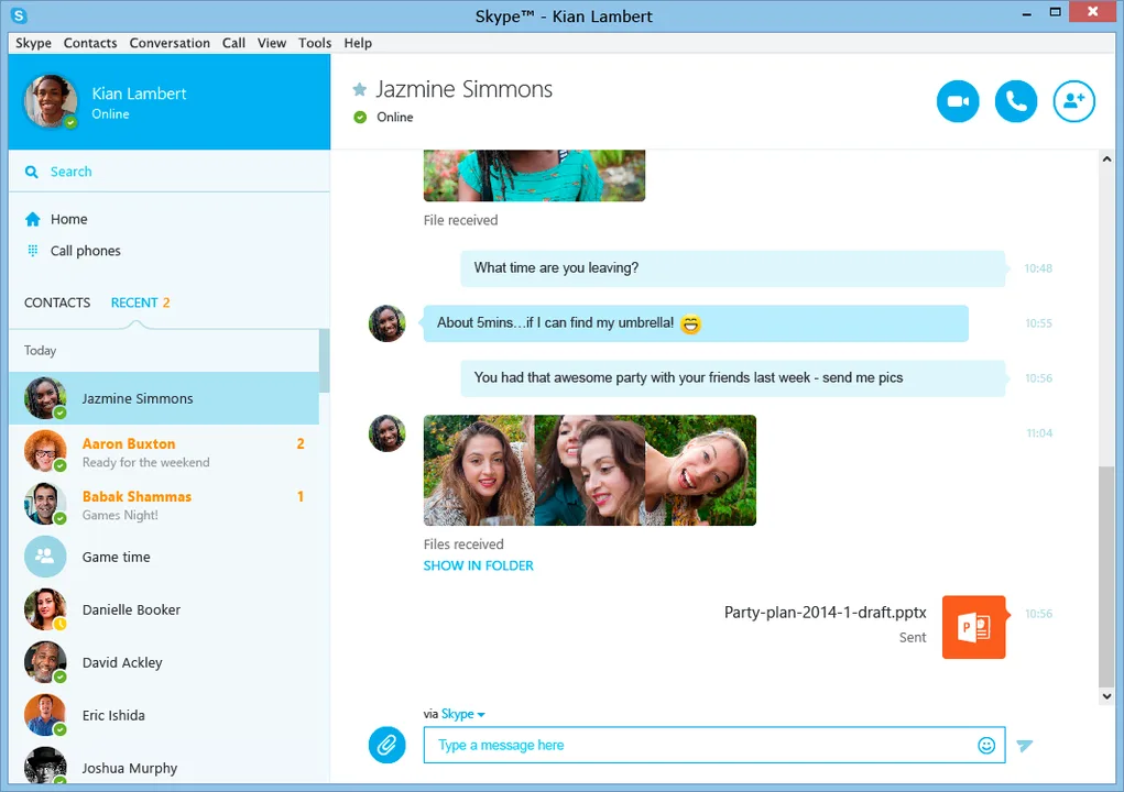
The new interface/layout is in no way suitable for everyone. I use Skype for work, I don't want it to look like blue smartphone texts, and I NEED to be able to follow the chat as easily as possible. Especially in a group chat of 30+ people. They need to know that this interface change is unacceptable for many, dare I say MOST Skype users. This issue is very different from when Facebook, YouTube, or Twitter changes their interface/layout. Skype is, in many cases, directly tied to peoples livelihoods. It needs to look professional, it needs to be easy to read/follow, and as far as I'm concerned, it should never ever look like it currently does. Please, provide the option to use the previous layout.
Skype 7 might be the ugliest UI I've ever seen. If I wanted to use a mobile version of software, I would be on my phone.
New update hurts my eyes and is hard to look at. Each message used to take up 1 line, now they take up 3 per message. Can only view 9 contacts or 4 threads on the screen nav. SERIOUSLY WTF?!?
this new one sucks, old one was 100 times better
This update made my eyes burn
A toddler could make a better UI than this, fix it, even apple have better designers.
First destroying the iOS version, now PC? Microsoft why do you want us to hate you so?
Share this petition
Share this petition to help it reach more people.
Your share link
Status: Closed — this petition is no longer accepting signatures.
Final supporters
20 Comments
Completely unacceptable. The new layout looks like it was designed for phones/tablets. In no way is it suitable for a desktop/laptop. The old layout was much easier to follow, and the colors were much easier on the eyes.
The new interface/layout is in no way suitable for everyone. I use Skype for work, I don't want it to look like blue smartphone texts, and I NEED to be able to follow the chat as easily as possible. Especially in a group chat of 30+ people. They need to know that this interface change is unacceptable for many, dare I say MOST Skype users. This issue is very different from when Facebook, YouTube, or Twitter changes their interface/layout. Skype is, in many cases, directly tied to peoples livelihoods. It needs to look professional, it needs to be easy to read/follow, and as far as I'm concerned, it should never ever look like it currently does. Please, provide the option to use the previous layout.
Skype 7 might be the ugliest UI I've ever seen. If I wanted to use a mobile version of software, I would be on my phone.
New update hurts my eyes and is hard to look at. Each message used to take up 1 line, now they take up 3 per message. Can only view 9 contacts or 4 threads on the screen nav. SERIOUSLY WTF?!?
this new one sucks, old one was 100 times better
This update made my eyes burn
A toddler could make a better UI than this, fix it, even apple have better designers.
First destroying the iOS version, now PC? Microsoft why do you want us to hate you so?
Share this petition
Share this petition to help it reach more people.
Your share link
Petitions like this
Other petitions you might want to support
Scan to share
Anyone who scans this can sign the petition.
Completely unacceptable. The new layout looks like it was designed for phones/tablets. In no way is it suitable for a desktop/laptop. The old layout was much easier to follow, and the colors were much easier on the eyes.