Status: Closed — this petition is no longer accepting signatures.


Final supporters
More like this
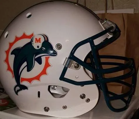
Please bring back the old logo

New logo Now
10 Comments
New logo is terrible, female Dolphin with eyes closed in receptive position. Old logo was timeless and flawless!
CHANNGE THE LOGO
Couldn't agree more! New logo looks VERY lame! BRING BACK THE ORIGINAL DOLPHIN LOGO.
Go back to the old logo.
The old logo looked like a dolphin that was ready to fight, the new one now looks stupid and like it is just flipping in the air.
The new Dolphins logo is awful. I will not buy any Dolphins stuff with it, only the old logos. Change it back!!!
It's weak, very weak...
Share this petition
Share this petition to help it reach more people.
Your share link
Status: Closed — this petition is no longer accepting signatures.
Final supporters
10 Comments
Stick with tradition...our uniforms have always been special....now they are light and pastel and suck! Go back to the auqua and orange of the early 90's or around 84...put the helmet back on the dolphin!
New logo is terrible, female Dolphin with eyes closed in receptive position. Old logo was timeless and flawless!
CHANNGE THE LOGO
Couldn't agree more! New logo looks VERY lame! BRING BACK THE ORIGINAL DOLPHIN LOGO.
Go back to the old logo.
The old logo looked like a dolphin that was ready to fight, the new one now looks stupid and like it is just flipping in the air.
The new Dolphins logo is awful. I will not buy any Dolphins stuff with it, only the old logos. Change it back!!!
It's weak, very weak...
Share this petition
Share this petition to help it reach more people.
Your share link
Petitions like this
Other petitions you might want to support


Scan to share
Anyone who scans this can sign the petition.
Stick with tradition...our uniforms have always been special....now they are light and pastel and suck! Go back to the auqua and orange of the early 90's or around 84...put the helmet back on the dolphin!