Status: Closed — this petition is no longer accepting signatures.

Final supporters
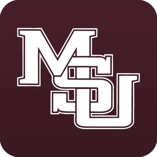
This has been long overdue and very badly needed within this community. It is time to go back to the interlocking MSU logo that all of the Mississippi State community once loved very much. The uniform designs for football from the late 90s when we were once signed with Nike was probably the nicest uniforms in Mississippi State. It is time the university is made aware of what the people want and need.
More like this

The Changing of Michigan State University's Logo
Keep the old Florida State Seminoles logo
11 Comments
bring back the good logo already we miss it
The interlocked logo looks better and a lot cleaner than the m state logo school is Mississippi state university and the MSU interlocked logo represents that better and looks better
This was and always will be our best logo. The walking bulldog is second.
Bring back interlocking MSU of go with the M over S on the helmets
Bring this logo back, please !
Please change unis soon.
Bring it back!!!
Share this petition
Share this petition to help it reach more people.
Your share link
Status: Closed — this petition is no longer accepting signatures.
Final supporters
This has been long overdue and very badly needed within this community. It is time to go back to the interlocking MSU logo that all of the Mississippi State community once loved very much. The uniform designs for football from the late 90s when we were once signed with Nike was probably the nicest uniforms in Mississippi State. It is time the university is made aware of what the people want and need.
11 Comments
The M-State logo looks like a corporate bank logo. The interlocking one is classic and represents the school way better than this modern junk.
bring back the good logo already we miss it
The interlocked logo looks better and a lot cleaner than the m state logo school is Mississippi state university and the MSU interlocked logo represents that better and looks better
This was and always will be our best logo. The walking bulldog is second.
Bring back interlocking MSU of go with the M over S on the helmets
Bring this logo back, please !
Please change unis soon.
Bring it back!!!
Share this petition
Share this petition to help it reach more people.
Your share link
Petitions like this
Other petitions you might want to support




Scan to share
Anyone who scans this can sign the petition.
The M-State logo looks like a corporate bank logo. The interlocking one is classic and represents the school way better than this modern junk.