The city has officially confirmed that the new signage and planters will be removed from our park and the bridge. We have secured a commitment that future installations will require public consultation before approval. Thank you for your persistence in protecting our community space.
November 26, 2018

Final supporters
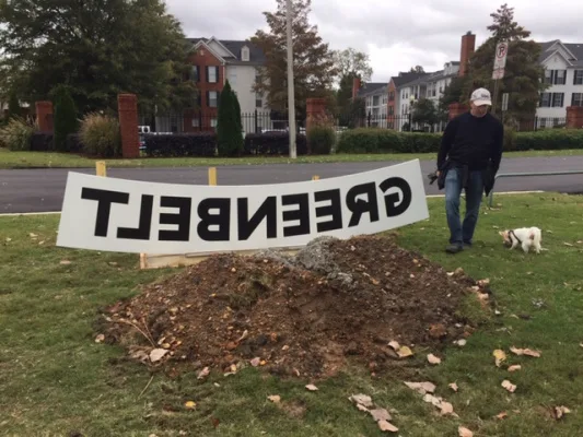
We, the people and citizenry of Mud Island feel that the new signage that has been installed along our Greenbelt Park is not in keeping with our Island or beloved park and demand that the new signage, along with the watering troughs (planters) that were placed on the east end of A.W.Willis Bridge be removed at once.
We further demand that from now on any new signage and/or installations of any type that are proposed to be installed on the Mud Island Parks be presented to the citizenry via a highly visible public forum such as NEXTDOOR to assure that the people who are most effected by such proposals have ample opportunity to view them and that entities such as, but not limited to, the Memphis River Parks Partnership gage the citizens reactions before proceeding.
Updates
November 8, 2018
The steady growth of this petition indicates that many residents share a firm expectation regarding the preservation of our park aesthetic. This momentum confirms that local decision makers must prioritize public consultation before altering our community spaces.
Reached 100 supporters
November 8, 2018
70 Comments
I don't mind the planters, but the majority of the signs are awful. I'm trying to like the totem ones, but I especially hate the colors. I live in a high rise and keep thinking someone left pink trash along the river, but it is a new sign.
These sings are of poor taste and do not fit. If the Memphis River Parks Partnership wants to do something useful and positive, pave the road into Mud Island River Park, it is a mine field. Public bathrooms would also make more sense than metal tubs and ugly signs.
The signage is unattractive, and inappropriate to the location, and more to the point looks technically wrong. The typography is weird; the 'G' seems to be a different width, or possibly typeface, and is at the wrong angle, while the quirky construction of the 'R' just looks like something went wrong in the drawing program.
Please remove the out of place signage and water troughs. The Mud Island residents work very hard, spend a lot of time and money, to keep the community aesthetically pleasing and these items are offensive to put it nicely.
Having just moved to Memphis and Mud - these signs and horse troughs certainly distract from the beauty that is Mud - what a shame the community impacted was not involved in the decisions being made.
Absolutely hideous and out of place.
The sign does not match Harbor Town. Plus, it is backwards.
Share this petition
Share this petition to help it reach more people.
Your share link
The city has officially confirmed that the new signage and planters will be removed from our park and the bridge. We have secured a commitment that future installations will require public consultation before approval. Thank you for your persistence in protecting our community space.
November 26, 2018
Final supporters
We, the people and citizenry of Mud Island feel that the new signage that has been installed along our Greenbelt Park is not in keeping with our Island or beloved park and demand that the new signage, along with the watering troughs (planters) that were placed on the east end of A.W.Willis Bridge be removed at once.
We further demand that from now on any new signage and/or installations of any type that are proposed to be installed on the Mud Island Parks be presented to the citizenry via a highly visible public forum such as NEXTDOOR to assure that the people who are most effected by such proposals have ample opportunity to view them and that entities such as, but not limited to, the Memphis River Parks Partnership gage the citizens reactions before proceeding.
Updates
November 8, 2018
The steady growth of this petition indicates that many residents share a firm expectation regarding the preservation of our park aesthetic. This momentum confirms that local decision makers must prioritize public consultation before altering our community spaces.
Reached 100 supporters
November 8, 2018
70 Comments
The signs really don’t fit in and the backwards lettering make no sense as designed. Perhaps if lettering was cut out, but not as painted signs. The signed and planters give the impression that we wanted to make improvements, but we were too cheap to do it right.
I don't mind the planters, but the majority of the signs are awful. I'm trying to like the totem ones, but I especially hate the colors. I live in a high rise and keep thinking someone left pink trash along the river, but it is a new sign.
These sings are of poor taste and do not fit. If the Memphis River Parks Partnership wants to do something useful and positive, pave the road into Mud Island River Park, it is a mine field. Public bathrooms would also make more sense than metal tubs and ugly signs.
The signage is unattractive, and inappropriate to the location, and more to the point looks technically wrong. The typography is weird; the 'G' seems to be a different width, or possibly typeface, and is at the wrong angle, while the quirky construction of the 'R' just looks like something went wrong in the drawing program.
Please remove the out of place signage and water troughs. The Mud Island residents work very hard, spend a lot of time and money, to keep the community aesthetically pleasing and these items are offensive to put it nicely.
Having just moved to Memphis and Mud - these signs and horse troughs certainly distract from the beauty that is Mud - what a shame the community impacted was not involved in the decisions being made.
Absolutely hideous and out of place.
The sign does not match Harbor Town. Plus, it is backwards.
Share this petition
Share this petition to help it reach more people.
Your share link
Petitions like this
Other petitions you might want to support




Scan to share
Anyone who scans this can sign the petition.
The signs really don’t fit in and the backwards lettering make no sense as designed. Perhaps if lettering was cut out, but not as painted signs. The signed and planters give the impression that we wanted to make improvements, but we were too cheap to do it right.