Status: Closed — this petition is no longer accepting signatures.


Final supporters
More like this
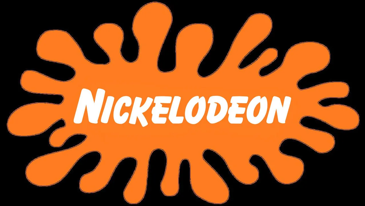
Bring Back The Old Nickelodeon Logo
Please bring back the old logo
Updates
October 19, 2011
I honestly cannot believe how many people actually feel this way and keep appearing out of nowhere to say the splat needs to return because that orange blob is honestly part of my childhood soul. It feels like the whole world spent the last week collectively deciding that the new branding is just plain wrong compared to the classic design that we all know should have never gone away.
11 Comments
BRING BACK THE SPLAT!!!!!
The splat logo was iconic. Who even thought of changing it? It looks so plain now.
the new one is just so boring!! bring back the splat it was way better
i grew up with the splat and seeing it gone makes me sad :( nick just isnt the same anymore
pls nick bring it back. it was the best logo ever
i would really like the splat back
i would really like the splat back
POO
Share this petition
Share this petition to help it reach more people.
Your share link
Status: Closed — this petition is no longer accepting signatures.
Final supporters
Updates
October 19, 2011
I honestly cannot believe how many people actually feel this way and keep appearing out of nowhere to say the splat needs to return because that orange blob is honestly part of my childhood soul. It feels like the whole world spent the last week collectively deciding that the new branding is just plain wrong compared to the classic design that we all know should have never gone away.
11 Comments
Yes. I EXTREMELY miss the Awesome "splat" logo. Plus, you spelled "it's so" wrong. You're right anywho. The new logo Is dumb, stupid, not awesome & is like burning down the White House. It's easy, just like when GAP did it. Lets not forget this: Over the few past years of Nick, we look at the right-hand bottom corner of the screen, we saw the splat! Everything by Nick squished in to a little orange "accident" with capital Bazooka-fonted "NICKELODEON" stitched across it.
BRING BACK THE SPLAT!!!!!
The splat logo was iconic. Who even thought of changing it? It looks so plain now.
the new one is just so boring!! bring back the splat it was way better
i grew up with the splat and seeing it gone makes me sad :( nick just isnt the same anymore
pls nick bring it back. it was the best logo ever
i would really like the splat back
i would really like the splat back
POO
Share this petition
Share this petition to help it reach more people.
Your share link
Petitions like this
Other petitions you might want to support




Scan to share
Anyone who scans this can sign the petition.
Yes. I EXTREMELY miss the Awesome "splat" logo. Plus, you spelled "it's so" wrong. You're right anywho. The new logo Is dumb, stupid, not awesome & is like burning down the White House. It's easy, just like when GAP did it. Lets not forget this: Over the few past years of Nick, we look at the right-hand bottom corner of the screen, we saw the splat! Everything by Nick squished in to a little orange "accident" with capital Bazooka-fonted "NICKELODEON" stitched across it.