Status: Closed — this petition is no longer accepting signatures.

Final supporters
More like this
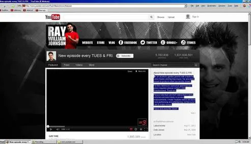
Old YouTube Layout
Dear Google get rid of the "New Look"
Updates
October 7, 2013
I have finished drafting a formal request to the Google interface design team regarding the utility of the previous navigation layout. I am now identifying the correct department heads to ensure this document reaches the appropriate decision makers.
6 Comments
Totally agree. The old layout was way cleaner and easier to read. Change it back google!!
The new one is just ugly. Why fix what wasnt broken?
This new look is horrible. Cant even see where the links start and end anymore.
So much wasted space now. Whoever designed this layout clearly doesnt use google every day
I hate the new white bar it blends in with everything else and is so hard to find sometimes. bring back the black one!
Share this petition
Share this petition to help it reach more people.
Your share link
Status: Closed — this petition is no longer accepting signatures.
Final supporters
Updates
October 7, 2013
I have finished drafting a formal request to the Google interface design team regarding the utility of the previous navigation layout. I am now identifying the correct department heads to ensure this document reaches the appropriate decision makers.
6 Comments
Stupid redesign. Just give us the option to pick the theme we want.
Totally agree. The old layout was way cleaner and easier to read. Change it back google!!
The new one is just ugly. Why fix what wasnt broken?
This new look is horrible. Cant even see where the links start and end anymore.
So much wasted space now. Whoever designed this layout clearly doesnt use google every day
I hate the new white bar it blends in with everything else and is so hard to find sometimes. bring back the black one!
Share this petition
Share this petition to help it reach more people.
Your share link
Petitions like this
Other petitions you might want to support




Scan to share
Anyone who scans this can sign the petition.
Stupid redesign. Just give us the option to pick the theme we want.